COVID-19 Dashboard
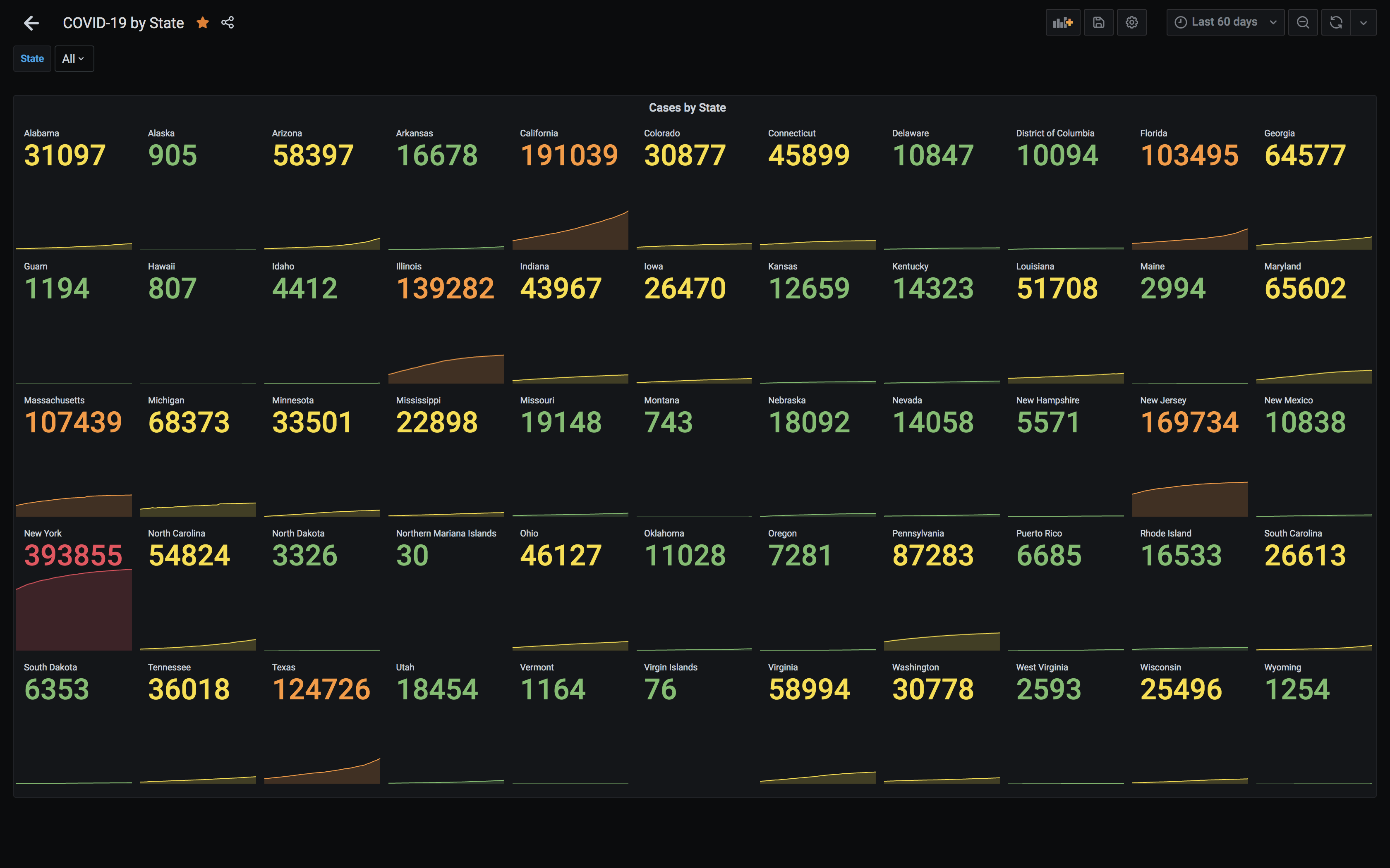
I wanted to provide a way for people to visualize the impact of COVID-19 in the US over time with the New York Times COVID-19 dataset. I wanted this to be public, easy-to-use, and using off-the-shelf tools. With those requirements, I decided to pipe the time-series data into InfluxDB and visualize it with Grafana.
A few notes on the underlying data:
- This data is only for the US
- States, and even counties, qualify "cases" and "deaths" differently. For example, when a resident of Florida died in Los Angeles, the NY Times recorded her death as having occurred in California rather than Florida, though officials in Florida counted her case in their own records
More details, methodology, and definitions can be found at the New York Times COVID-19 data repository.
Built using Grafana, InfluxDB, and csv-to-influxdb. Data from New York Times. Running on AWS, managed by Terraform.
Source available on Github.
The project site is no longer live, but there are instructions on how to run the project in the source code link above.